We are building a team that is curious, innovative and ambitious – some from the language service background, others from a totally unrelated field. But the common thread that moves us forward is the determination to bring the human back to languages and create an impact through our work. Eager to join our team of talented ‘Humans’?
Learn more about our journey, our team, and our mission.
Translate By Humans completed the translations thoroughly, accurately, and quickly. Pricing is the best around!
FGM Ventures LLC
Translate By Humans' delivery times are great, and the staff is very responsive to our requests! Translations have been easy for us to apply to our platform.
Antidote
Translate By Humans is always fast to answer my emails, that is always good.
Every language is a part of a culture and consequently, reflects it. These cultural peculiarities are not just restricted to words and phrases. They extend to colours, symbols, and design as well.
In simple terms, localisation considers all these peculiarities and incorporates them into content and design. It ensures that your clients or customers, who are a part of that culture, are better able to identify with your brand message. This cultural context plays an essential role in their buying decision. It can be the difference between customers misinterpreting your message and customers loving your product or service.
As we mentioned above, localising your designs for product or marketing help you in providing your customers with an enhanced, culturally relevant experience.
Best Practices for Localising Design
Ideally, localisation and translation go hand-in-hand. If you translate your website’s content and don’t localise it, it’ll end up confusing your website visitors. Say your English customers find your website to be notably user-friendly. However, your Arabic customers may have different feedback (given the fact they read from right to left).
Providing a seamless, user-friendly, and culturally relevant experience doesn’t appear to be an easy task does it? We understand it can be challenging and hence, it’s always advisable to hire a professional human translation agency that specialises in localisation. A native translator is well versed with the language and culture and can help create appealing products, websites, or marketing material that fulfil their purpose successfully.
Like every other process, there are some practices that designers and brands follow while localising designs. We’ve listed them for you here:
Create a Dynamic Layout
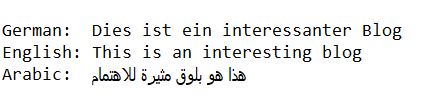
While one language may have one term that conveys a message perfectly well, another language may use a group of words to convey the same message. From a design perspective, this makes a substantial amount of difference – more words require more space. So, designing a dynamic layout to accommodate different languages without affecting the interface is a smart decision. A dynamic design accounts for text expansion as well as text contraction. For instance, localising from English to Spanish can require about 25% expansion, while English to German may require 35% expansion. On the other hand, characters in Chinese and Japanese take up less space horizontally but more space vertically.
Optimise space for different character lengths in different languages
Adapt Design for Right to Left Languages
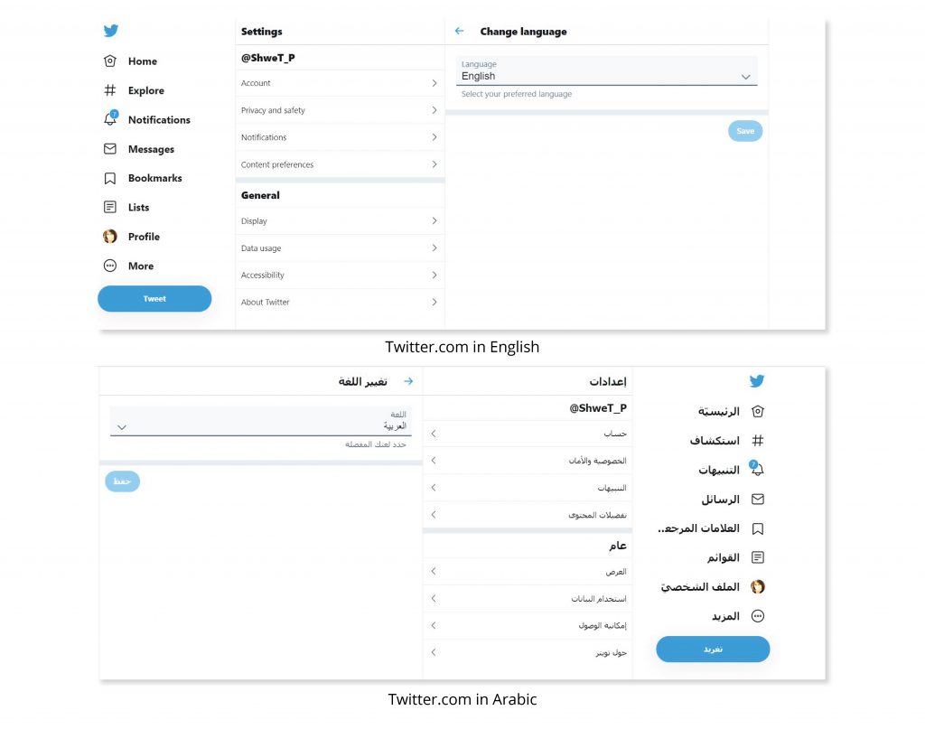
While we read most languages from left to right, there are some (Arabic and Hebrew) which we read from right to left. In such cases, the entire design needs to change for better readability.
Twitter homepage in English and Arabic
However, the following elements should not be flipped even in the right to left format:
Embedded text in images doesn’t serve much of a purpose. Moreover, designers will be required to create separate assets (embedded text) for every linguistic section they are covering and hence, it’s best to avoid them.
Avoid embedding text in images
In case you do include embedded text in images, insert the text in code to make it dynamic and easily adaptable through set values.
Present Numerical Data as per the Linguistic Norms
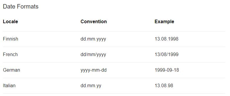
The numerical data you would generally use includes time specifications, dates, and currencies. Every language and culture has a different way of presenting these numerals. For instance, the Americans use the MM-DD-YYYY format for dates while the British use the DD-MM-YYYY format.
Date formats differ in languages like Finnish, French, German and Italian.
Similarly, where and how you place currency symbols must be determined by the language of the material. In French, they place the currency symbol after the amount, and they use the comma (,) as a decimal. So, if you’re localising your user interface for French, the currency will be displayed as 100 ¥; 10,00 R; 10,00 €.
For a positive user experience, you must present numerical data in a manner relevant to that particular language.
Choose Fonts Wisely
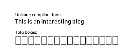
The font you choose for your website or product must be displayed well in all languages. Say, you use a font that looks great when you are accessing your website in English. However, your customer who is accessing the site in Chinese may be seeing empty boxes like shown below.
Tofu boxes appear when the system fails to display the correct font
These are called tofu boxes. They appear when a program cannot find any font to display text. To avoid these ugly boxes, choose a Unicode-compliant font. All global languages support Unicode fonts. Also, encode the text and characters of your interface in a way that can enable the conversion of text data globally.
Note: Google has recently introduced Google Noto Fonts (available for free) which aims to support and provide a seamless experience across all languages.
Set the Algorithm for Sorting Rules
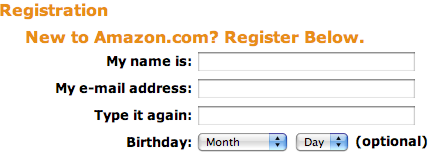
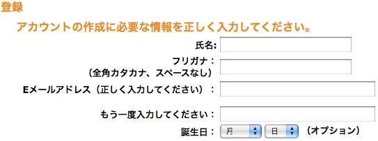
If your website or product has data that’s sorted – displayed in a specific sequence – you must ensure that it’s sorted as per the language’s rules. For instance, if the data is sorted alphabetically, it might not be sorted in the same for every language. Your algorithm must be able to adapt to the language and culture-specific rules. Japanese is a language where sorting is very complicated as it has thousands of characters and four types of written characters. See how Amazon has found a solution to this problem:
Amazon’s registration page in English
Amazon’s registration page in Japanese
Use the Right Icons & Symbols
As we mentioned above, the cultural peculiarities of a language extend to icons, symbols, and characters. Sometimes, these peculiarities can cause your customers to misinterpret your message.
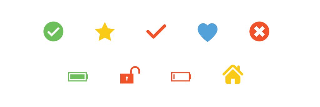
It would, therefore, be wise if you avoid certain icons and symbols that might hold a different meaning across cultures. Instead, use universal symbols (like arrows). The Internation Organization for Standardization (ISO) has a list of graphical symbols that meet the global UI standards. If you are using symbols that are not universally known, use labels to define them correctly to avoid any misinterpretations.
Universally known and accepted icons
To Conclude
Eighty per cent of marketers in the USA, the UK, France, and Germany believe that content localisation is a fundamental process for penetrating new markets. Global brands like Nestle and Nike have even been localising their social accounts for their target audiences based in various parts of the world.
Many marketers have found design localisation to positively affect the reach, sales, and customer retention of a brand. Localising your content and design is a necessary step if you wish to have loyal customers across multiple countries, languages, and cultures.
A nice subtext like Get the latest delivered straight to your inbox.
RIGHT BANNER – SAME WIDTH HEIGHT CAN VARY
Εκτιμούμε την ακρίβεια και την προσοχή στη λεπτομέρεια που συνεπάγεται η επαγγελματική μετάφραση και εφαρμόζουμε αυτές τις αρχές για να δημιουργήσουμε συναρπαστικά και δίκαια παιχνίδια στο Nine Casino z-library Z-Library project Казино Joycasino предлагает своим игрокам удобные зеркала для обхода блокировок и быструю регистрацию. Щедрые бонусы и честные условия игры делают Джойказино отличным выбором для всех любителей азартных развлечений.